Using PCA to identify correlated stocks in Python
06 Jan 2018Overview
Principal component analysis is a well known technique typically used on high dimensional datasets, to represent variablity in a reduced number of characteristic dimensions, known as the principal components.
In this post, I will show how PCA can be used in reverse to quantitatively identify correlated time series. We will compare this with a more visually appealing correlation heatmap to validate the approach.
The plan:
- Clean and prepare the data
- Check for stationarity
- Generate qualitative correlation matrix
- Perform PCA
- Generate loadings plots
- Quantitatively identify and rank strongest correlated stocks
Using PCA in reverse
This approach is inspired by this paper, which shows that the often overlooked ‘smaller’ principal components representing a smaller proportion of the data variance may actually hold useful insights.
The authors suggest that the principal components may be broadly divided into three classes:
- The top few components which represent global variation within the dataset.
- A set of components representing the syncronised variation between certain members of the dataset.
- Components representing random fluctuations within the dataset.
Now, the second class of components is interesting when we want to look for correlations between certain members of the dataset. For example, considering which stock prices or indicies are correlated with each other over time. This is the application which we will use the technique.
The raw data
First, some data. Three real sets of data were used, specifically. Daily closing prices for the past 10 years of:
- A selection of stocks representing companies in different industries and geographies.
- A selection of industry indexes.
- A selection of geography indexes.
These files are in CSV format. They are imported as data frames, and then transposed to ensure that the shape is: dates (rows) x stock or index name (columns).
Cleaning and pre-processing
Pandas dataframes have great support for manipulating date-time data types. However the dates for our data are in the form “X20010103”, this date is 03.01.2001. So a dateconv function was defined to parse the dates into the correct type.
This was then applied to the three data frames, representing the daily indexes of countries, sectors and stocks repsectively.
trimmer = lambda x: x[1:]

def dateconv(dataframe,func):
    dataframe = dataframe.reset_index() #reindex so we can manipultate the date field as a column
    dataframe['index'] = dataframe['index'].apply(func) #remove the trailing X
    dataframe['index'] = pd.to_datetime(dataframe['index']) #convert the index col to datetime type
    dataframe = dataframe.set_index('index') #restore the index column as the actual dataframe index
    dataframe = dataframe[1:]
    return dataframe

countriesT = dateconv(countriesT,trimmer)
sectorsT = dateconv(sectorsT,trimmer)
stocksT = dateconv(stocksT,trimmer)
This is done because the date ranges of the three tables are different, and there is missing data. For example the price for a particular day may be available for the sector and country index, but not for the stock index. Ensuring pandas interprets these rows as dates will make it easier to join the tables later.
Log returns
As the stocks data are actually market caps and the countries and sector data are indicies. We need a way to compare these as relative rather than absolute values. The market cap data is also unlikely to be stationary - and so the trends would skew our analysis.
So, instead, we can calculate the log return at time t, defined as:
Merging the data
Now, we join together stock, country and sector data. As not all the stocks have records over the duration of the sector and region indicies, we need to only consider the period covered by the stocks. To do this, create a left join on the tables: stocks<-sectors<-countries.
So the dimensions of the three tables, and the subsequent combined table is as follows:
Dims of stocks: (1520, 11) # 11 stocks
Dims of sectors: (4213, 54) # 54 sector indicies
Dims of countries: (4213, 25) # 25 country indicies
Dims of combined data table: (1520, 90)
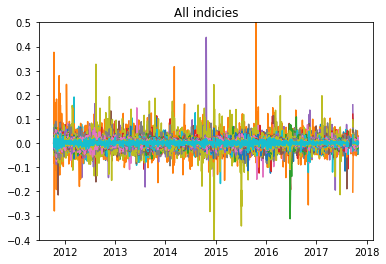
Now, finally we can plot the log returns of the combined data over the time range where the data is complete:
Checking for stationary data
It is important to check that our returns data does not contain any trends or seasonal effects. There are a number of ways we can check for this
1. ADF test
The null hypothesis of the Augmented Dickey-Fuller test, states that the time series can be represented by a “unit root”, (i.e. it has some time dependent structure). Rejecting this null hypothesis means that the time series is stationary. If the ADF test statistic is < -4 then we can reject the null hypothesis - i.e. we have a stationary time series.
The adfuller method can be used from the statsmodels library, and run on one of the columns of the data, (where 1 column represents the log returns of a stock or index over the time period). In this case we obtain a value of -21, indicating we can reject the null hypothysis.
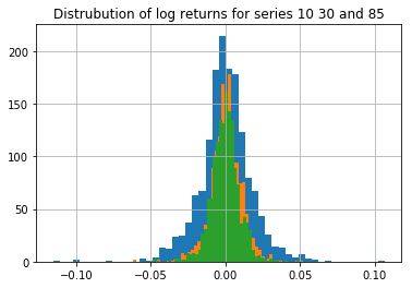
2. Inspection of the distribution
We can also plot the distribution of the returns for a selected series. If this distribution is approximately Gaussian then the data is likely to be stationary. Below, three randomly selected returns series are plotted - the results look fairly Gaussian.
Calculating the correlation matrix
We can now calculate the covariance and correlation matrix for the combined dataset. We will then use this correlation matrix for the PCA. (The correlation matrix is essentially the normalised covariance matrix)
Before doing this, the data is standardised and centered, by subtracting the mean and dividing by the standard deviation.
#manually calculate correlation coefficents - normalise by stdev.
combo = combo.dropna()
m = combo.mean(axis=0)
s = combo.std(ddof=1, axis=0)

# normalised time-series as an input for PCA
combo_pca = (combo - m)/s

c = np.cov(combo_pca.values.T)     # covariance matrix
co = np.corrcoef(combo_pca.values.T) #correlation matrix
Using Plotly, we can then plot this correlation matrix as an interactive heatmap:
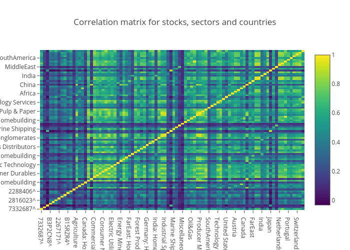
We can see some correlations between stocks and sectors from this plot when we zoom in and inspect the values. Some noticable hotspots from first glance:
- stock 7332687^ and the Nordic region (0.77)
- stock 6900212^ and the Japan Homebuilding market (0.66)
- stock 2288406^ and Oil & Gas (0.65)
Performing PCA
Perfomring PCA involves calculating the eigenvectors and eigenvalues of the covariance matrix. The eigenvectors (principal components) determine the directions of the new feature space, and the eigenvalues determine their magnitude, (i.e. the eigenvalues explain the variance of the data along the new feature axes.)
First, we decompose the covariance matrix into the corresponding eignvalues and eigenvectors and plot these as a heatmap.
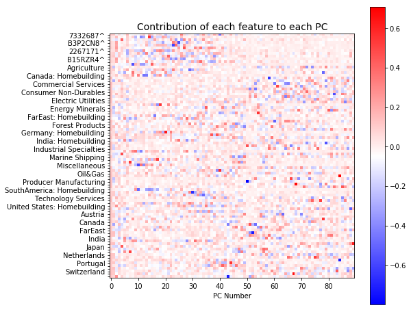
This plot shows the contribution of each index or stock to each principal component. There are 90 components all together. We can see that the early components (0-40) mainly describe the variation across all the stocks (red spots in top left corner). It also appears that the variation represented by the later components is more distributed.
The total variability in the system is now represented by the 90 components, (as opposed to the 1520 dimensions, representing the time steps, in the original dataset). The eigenvalues can be used to describe how much variance is explained by each component, (i.e. how the varaiance is distributed across our PC’s).
Below we plot this distribution:
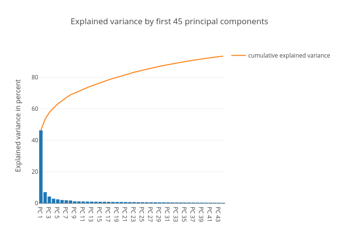
As we can see, most of the variance is concentrated in the top 1-3 components. These components capture “market wide” effects that impact all members of the dataset.
Following the approach described in the paper by Yang and Rea, we will now inpsect the last few components to try and identify correlated pairs of the dataset
Developing the loadings plot
As mentioned earlier, the eigenvalues represent the scale or magnitude of the variance, while the eigenvectors represent the direction. The “loadings” is essentially the combination of the direction and magnitude. The loading can be calculated by “loading” the eigenvector coefficient with the square root of the amount of variance:
We can plot these loadings together to better interpret the direction and magnitude of the correlation. The loadings for any pair of principal components can be considered, this is shown for components 86 and 87 below:
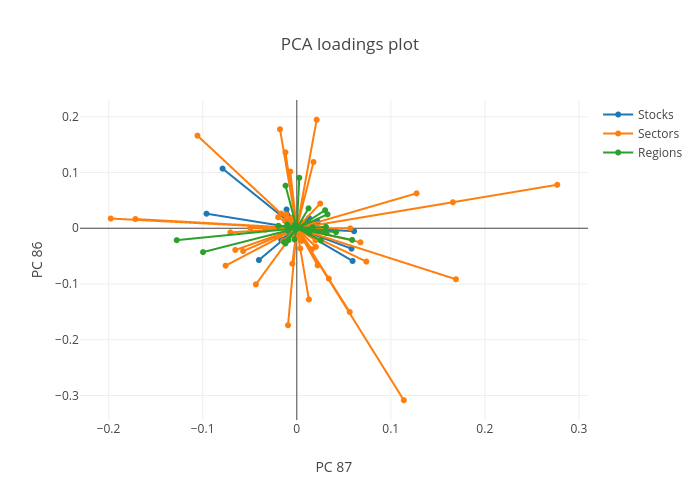
The loadings plot shows the relationships between correlated stocks and indicies in opposite quadrants. Indicies plotted in quadrant 1 are correlated with stocks or indicies in the diagonally opposite quadrant (3 in this case). The length of the line then indicates the strength of this relationship.
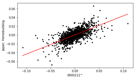
For example, stock 6900212^ correlates with the Japan homebuilding market, as they exist in opposite quadrants, (2 and 4 respectively). This is consistent with the bright spots shown in the original correlation matrix.
Using the loadings plots to identify and rank correlated stocks
We can use the loadings plot to quantify and rank the stocks in terms of the influence of the sectors or countries.
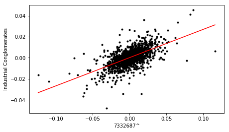
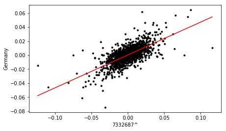
To do this, we categorise each of the 90 points on the loading plot into one of the four quadrants. Then, we look for pairs of points in opposite quadrants, (for example quadrant 1 vs 3, and quadrant 2 vs 4). Then, if one of these pairs of points represents a stock, we go back to the original dataset and cross plot the log returns of that stock and the associated market/sector index.
Using the cross plot, the value is calculated and a linear line of best fit added using the linregress function from the stats library. A cutoff value of 0.6 is then used to determine if the relationship is significant.
Cross plots for three of the most strongly correlated stocks identified from the loading plot, are shown below:
Finally, the dataframe containing correlation metrics for all pairs is sorted in terms descending order of value, to yield a ranked list of stocks, in terms of sector and country influence.
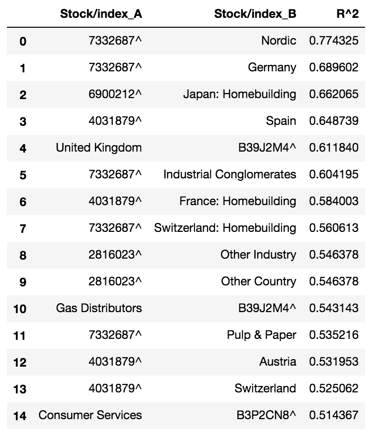
The top correlations listed in the above table are consistent with the results of the correlation heatmap produced earlier.
This analysis of the loadings plot, derived from the analysis of the last few principal components, provides a more quantitative method of ranking correlated stocks, without having to inspect each time series manually, or rely on a qualitative heatmap of overall correlations. It would be cool to apply this analysis in a ‘sliding window’ approach to evaluate correlations within different time horizons.
Hope you found it interesting!
You can find the full code for this project here